




The Ask
Build a brand from scratch around an athletic training product still in development, taking it from an unnamed concept to a launch-ready identity. Sparq was asked to research the market, define the positioning and strategic direction, develop the name and messaging, create the visual system, and design packaging that could communicate a neurological approach to performance across multiple sports.
Project Information
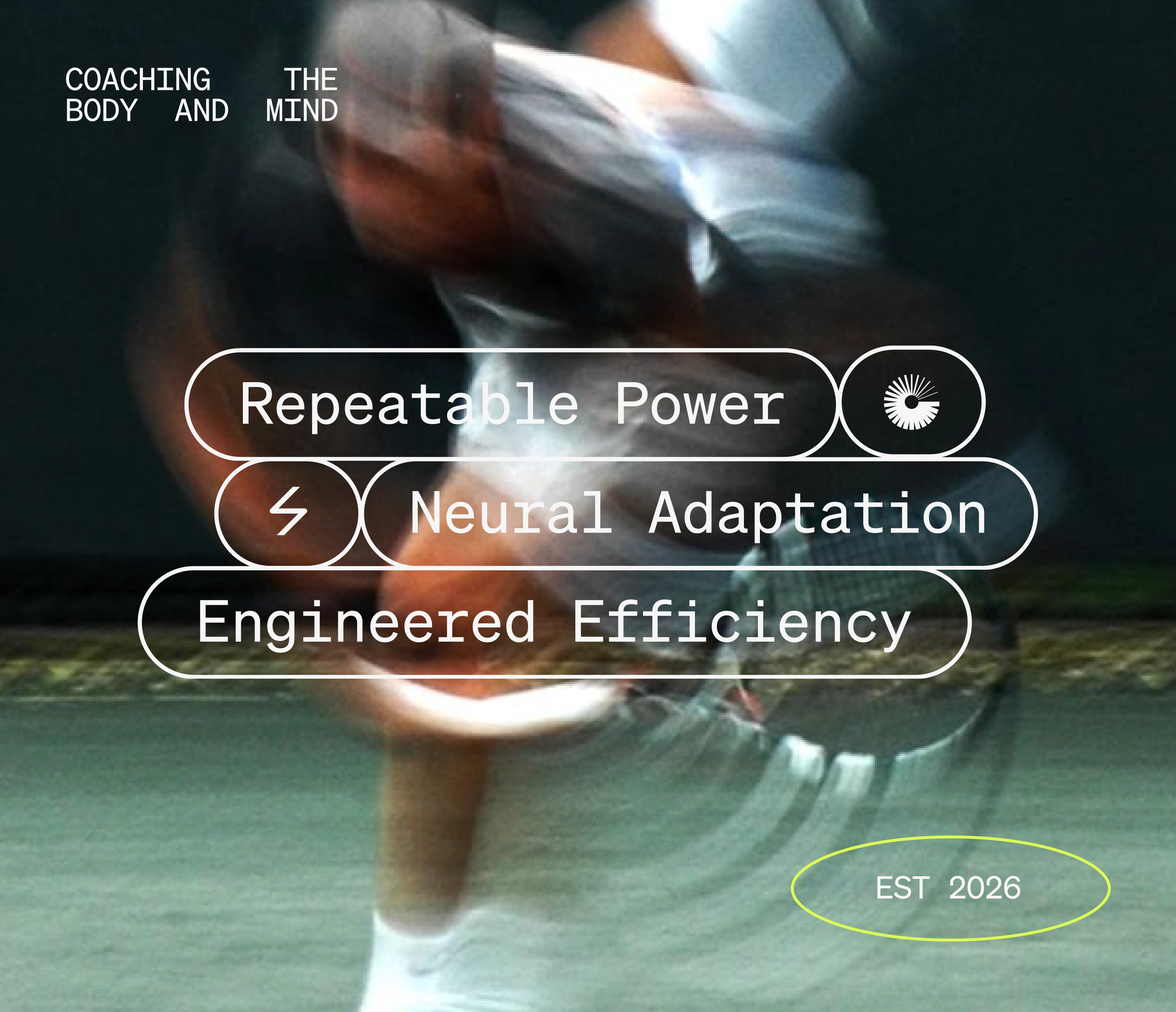
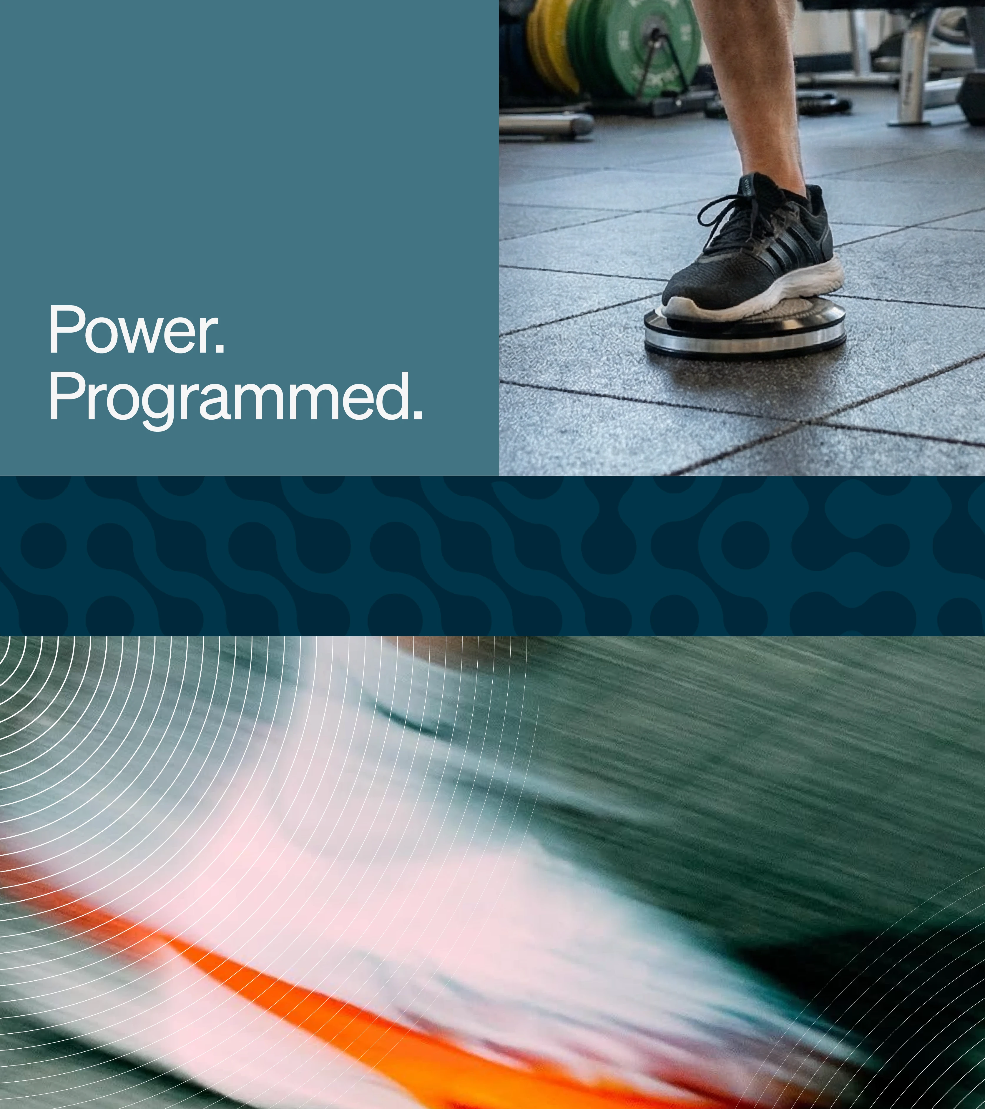
Sparq began with market research and positioning to define a space at the intersection of physical training and neural adaptation. From that foundation came the NeuroTorque name and a messaging system built around repeatable power, neural adaptation, and engineered efficiency.
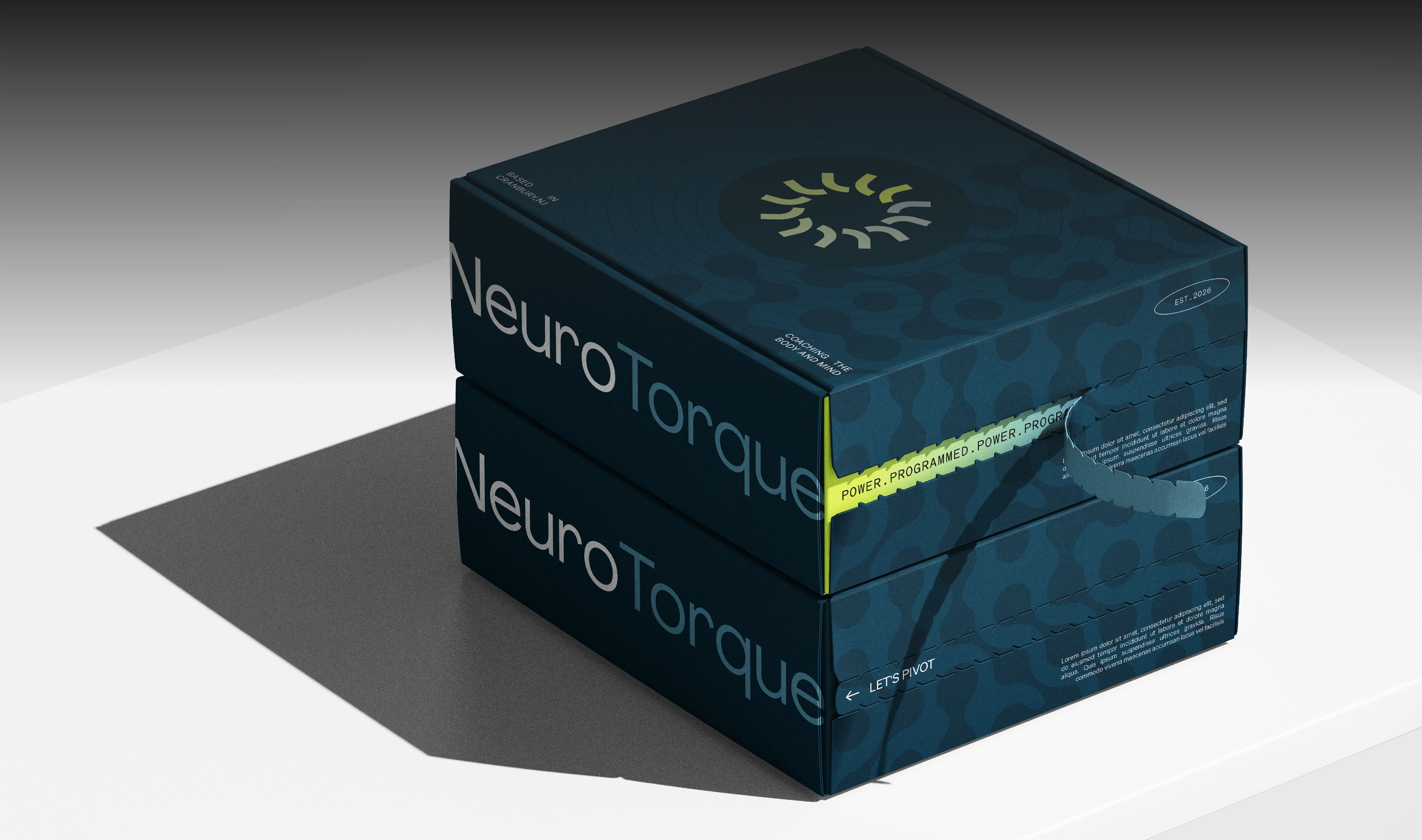
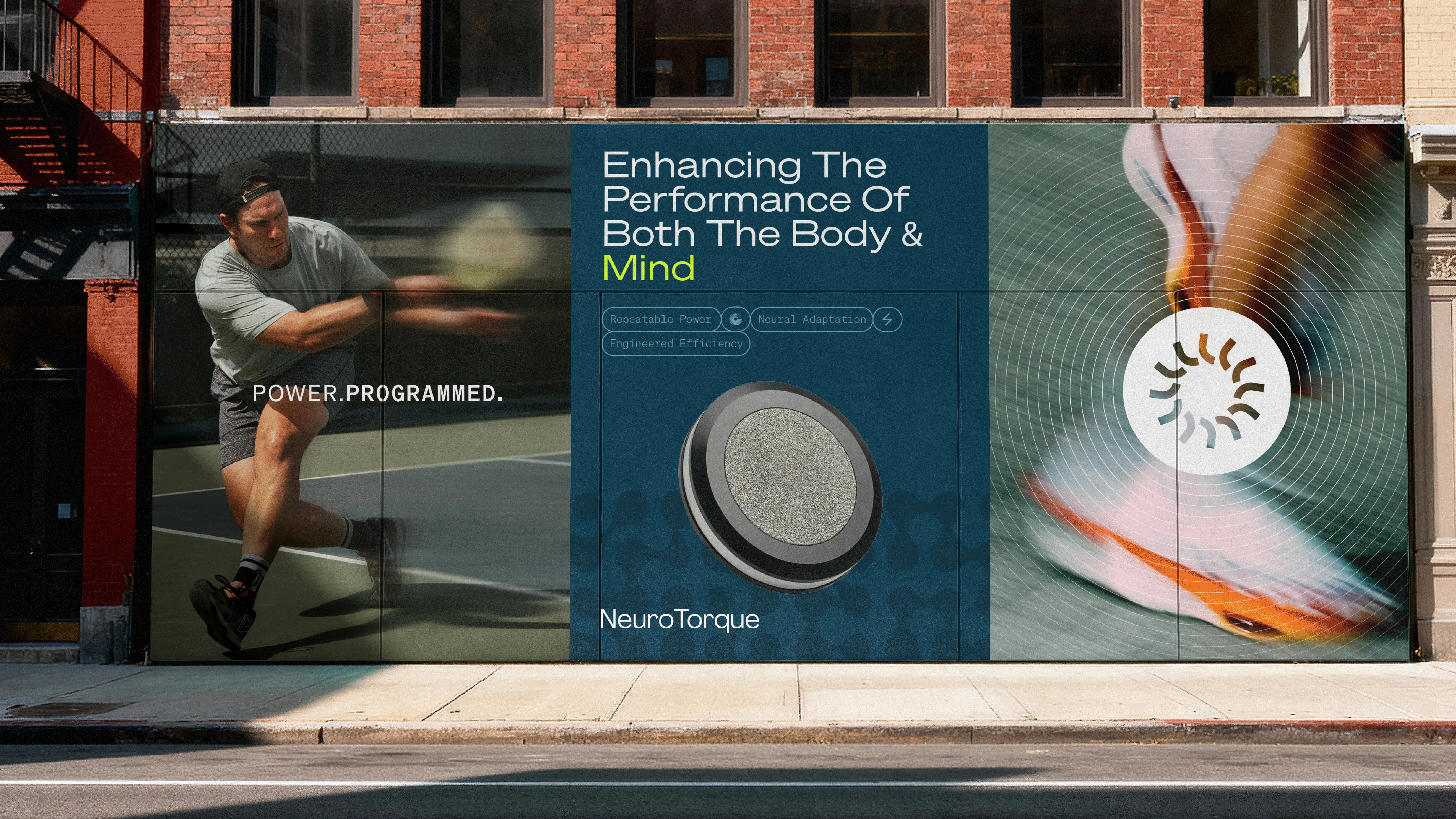
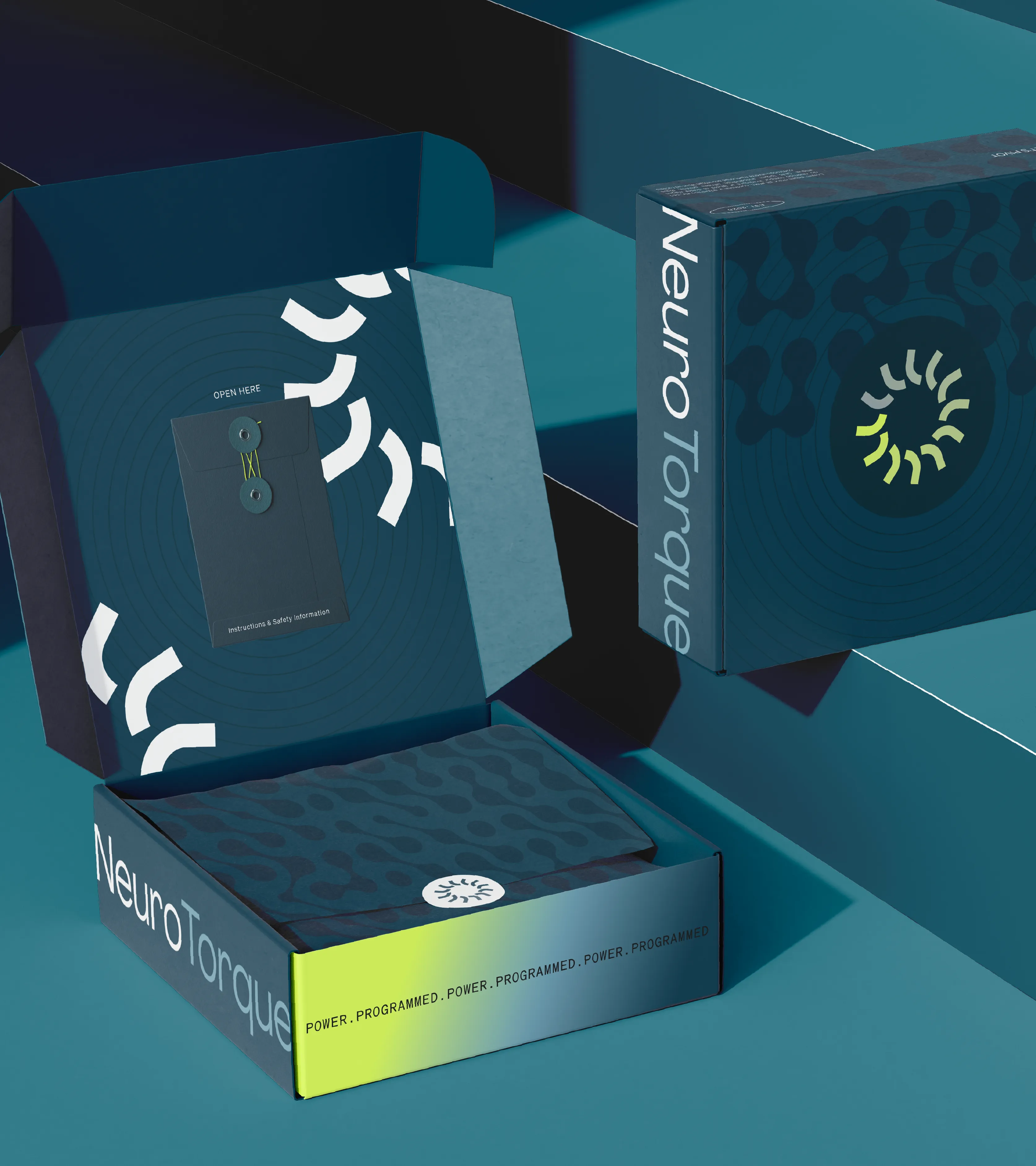
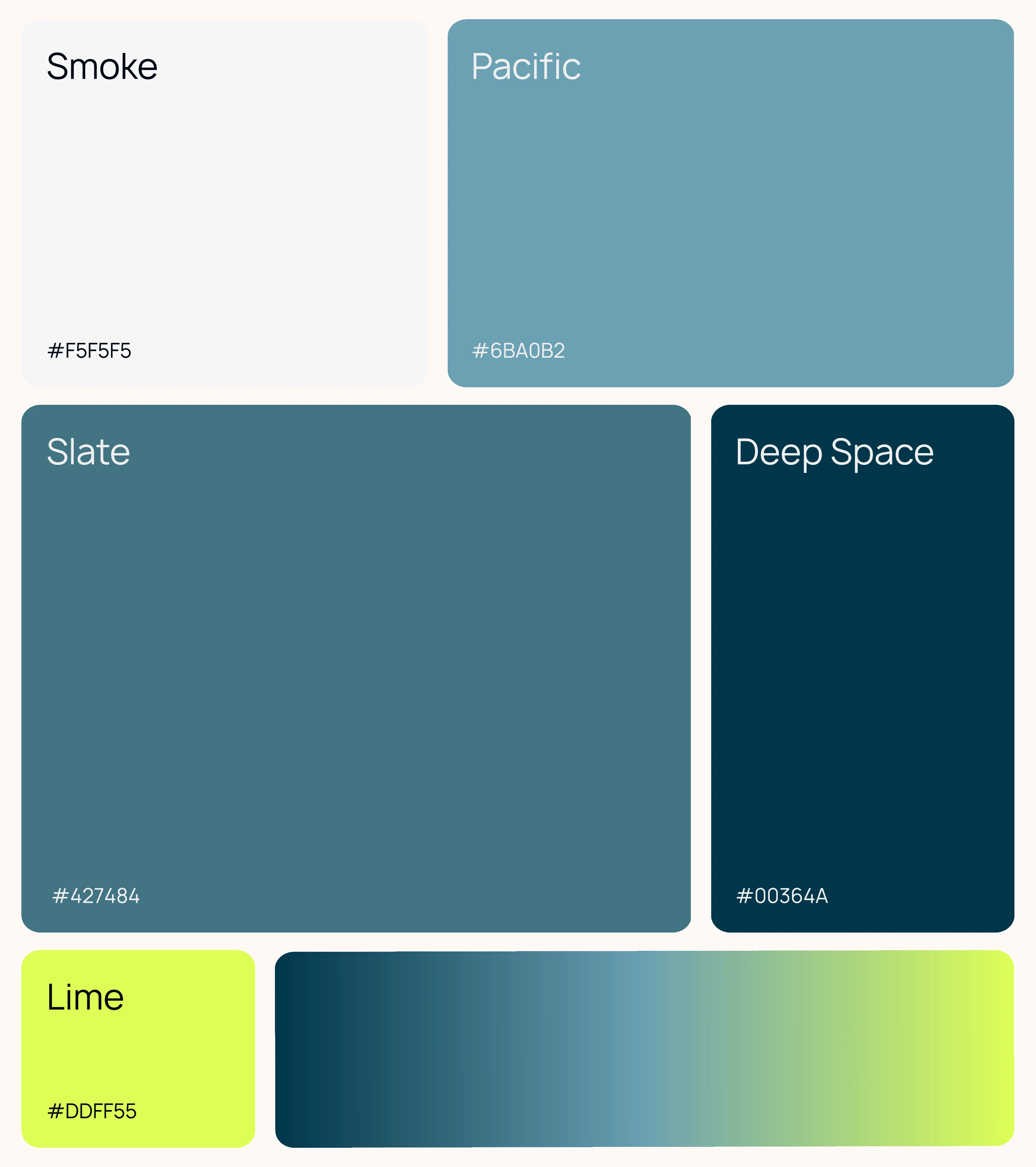
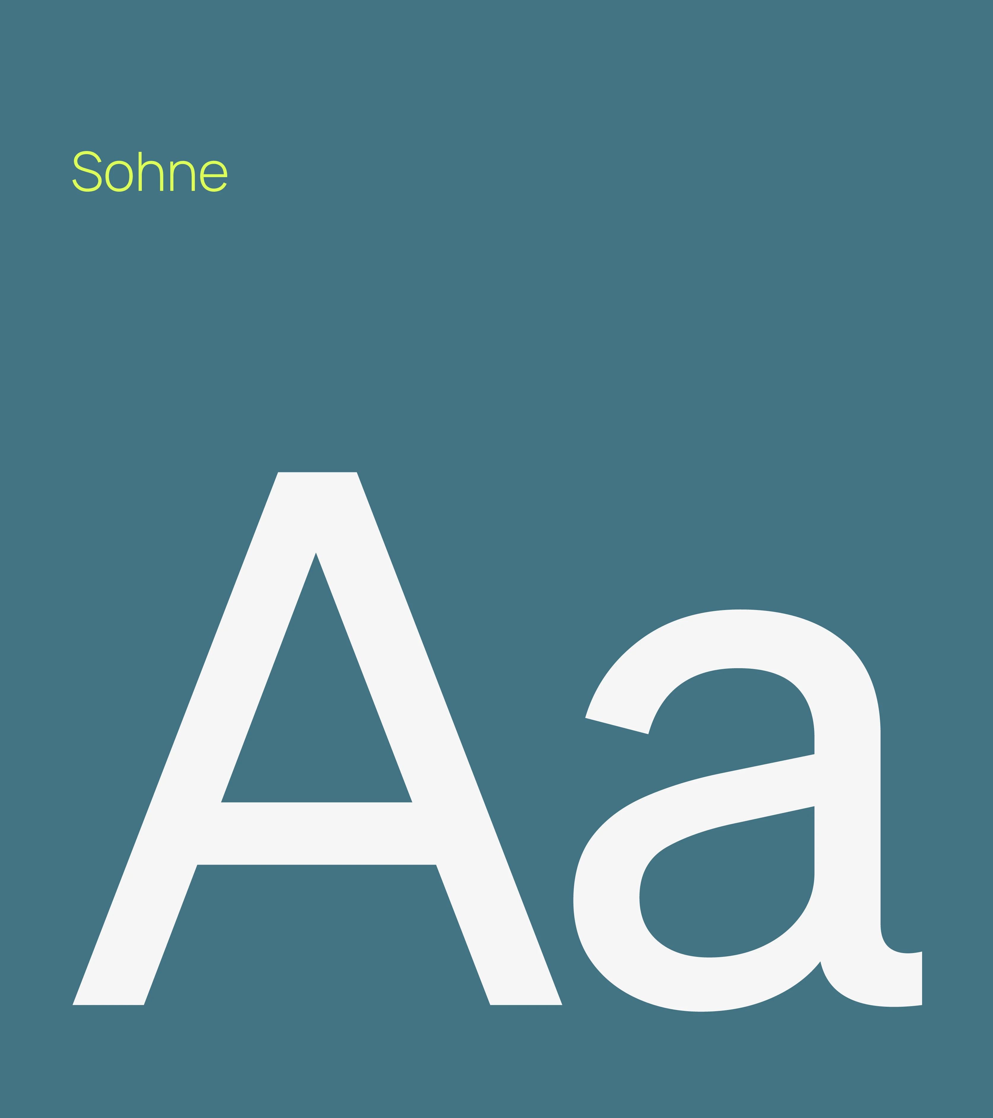
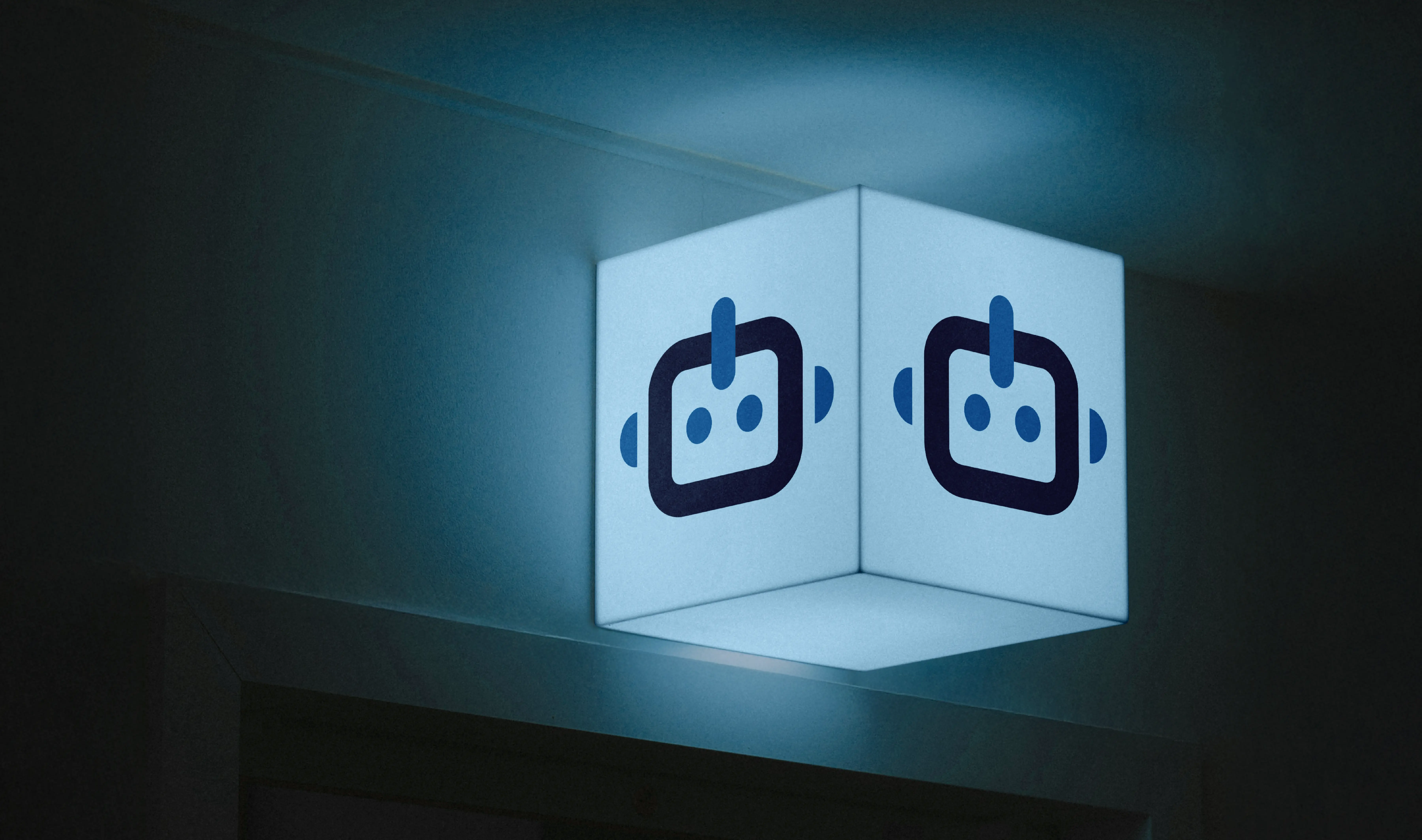
Sparq developed the logo, typography, motion-driven linework, supporting pattern, and packaging into one flexible system. The package balances a restrained exterior with an interactive opening experience, extending the strategy through every brand touchpoint.
Services
Strategic Planning
Branding & Design






.webp)


